Airbnb Photos Before & After: 10 Real Enhancements
Published on 4/2/2026
We get asked a lot: does AI photo enhancement actually make a meaningful difference, or is it just a subtle filter? The honest answer is that it depends entirely on the starting point of the photo. Some images need a lot of work. Others just need a nudge. Most fall somewhere in between.
To answer this properly, we took 10 real property photos submitted through ProntoPic and ran them through our enhancement pipeline. For each one, we documented exactly what changed and why it matters for a listing. No cherry-picked miracles. No before photos taken deliberately badly to make the after look dramatic. Just the actual, everyday photos that hosts and agents upload.
Here is what happened.
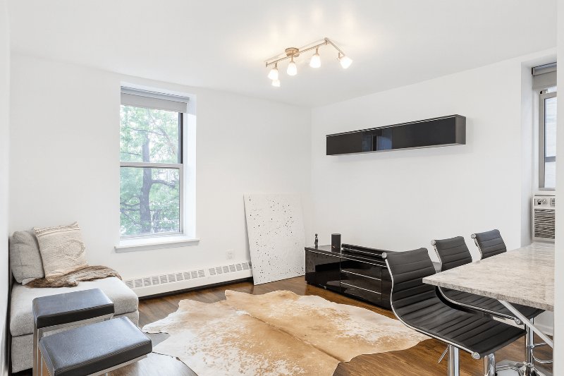
1. The living room shot under artificial light
This living room was photographed in the evening with the ceiling track lights on and no natural light coming in. The result is a heavy yellow-orange cast across the walls, floor, and furniture. The cowhide rug looks muddy, the walls read as beige instead of white, and the whole room feels smaller and darker than it actually is. After enhancement, the white balance was corrected to a neutral daylight tone, the exposure was lifted, and the room reads as clean and spacious. Same furniture, same angle, completely different first impression.
After
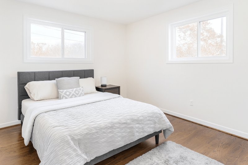
2. The bedroom with the blown windows
This bedroom has two large windows, which sounds great until you try to photograph it. The camera exposed for the room interior, which left both windows as pure white rectangles with no detail. You lose the natural light, the view of the trees outside, and the sense of the room being connected to the outside world. After processing, the window highlights were recovered and the interior exposure balanced, so the room feels bright and airy rather than closed off. The dark wood furniture and the overall layout now read clearly without the blown windows competing for attention.
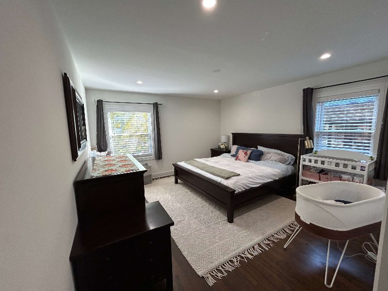 Before
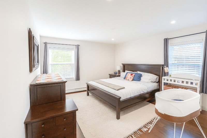 After
After
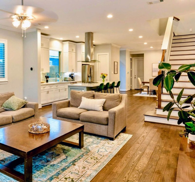
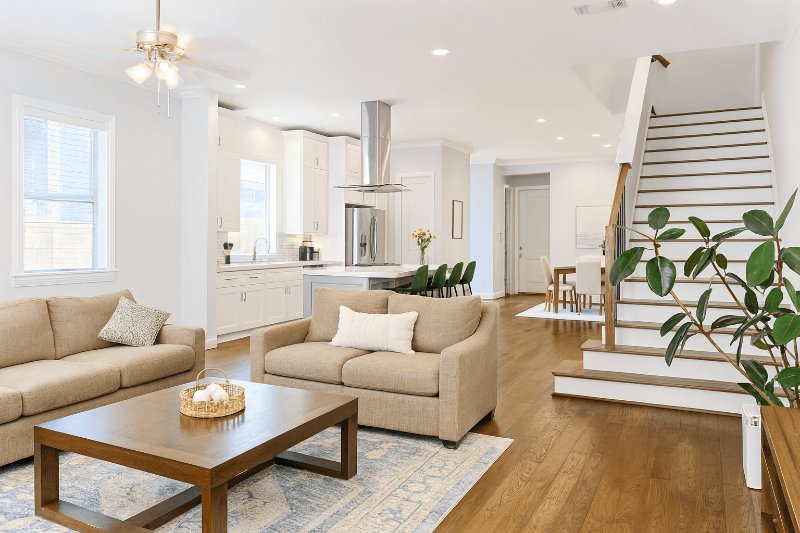
3. The open-plan space that looked like a cave
This lower-level open plan area has great bones: pendant lights, a spiral staircase, a dining area, and a bar setup. But the original photo was severely underexposed. The dark floors absorbed what little light there was, the pendant lights created harsh contrast pools, and the windows in the background were the only bright point in the frame. The overall effect made the space look uninviting and difficult to read. After enhancement, the overall brightness was lifted, shadow detail recovered in the floor and walls, and the space now reads as modern and functional rather than dark and unwelcoming.
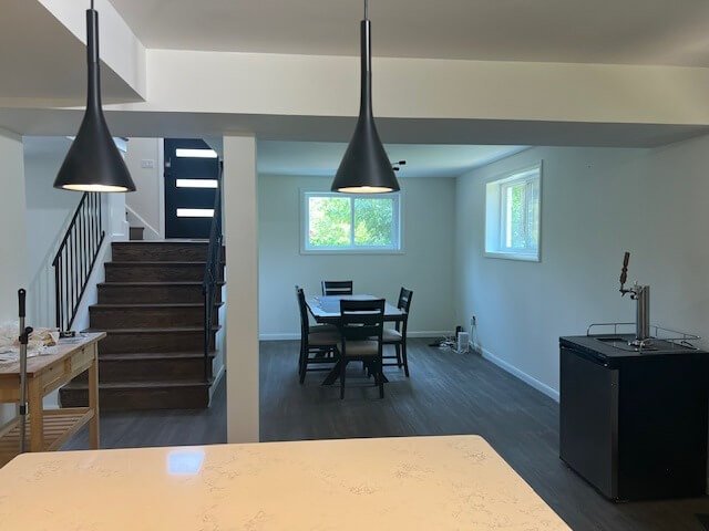 Before
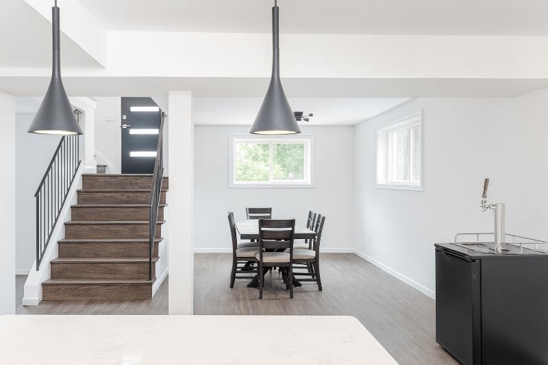 After
After
4. The living room with the backlit curtains
The warm light flooding through the sheer curtains in this living room creates a strong orange cast across the entire scene. The L-shaped sofa, the coffee table, and the walls all take on a yellowish-amber tone that misrepresents the actual neutral colours of the space. It is the kind of photo that makes a room look like it was shot in a Mediterranean villa in August, which is fine if that is accurate, but misleading if the actual space has cool white walls and a grey sofa. After correction, the white balance was brought back to neutral, the sofa reads as its actual colour, and the room looks clean and well-lit without the heavy warm tint.
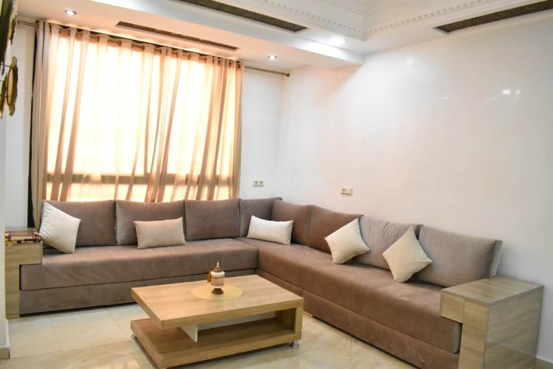 Before
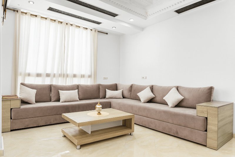 After
After
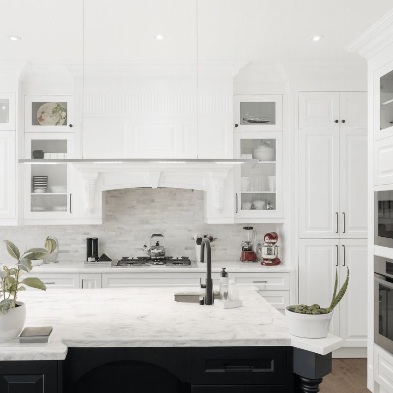
5. The white kitchen that looked flat
This is a genuinely beautiful kitchen: all-white shaker cabinets, a marble waterfall island, glass-front uppers, built-in appliances. But the original photo does not do it justice. The recessed lighting creates slight shadows under the upper cabinets, the marble surface looks flat rather than luminous, and the overall image lacks the crispness that makes a kitchen feel aspirational. After enhancement, the local contrast was increased, the cabinet whites were brightened without blowing out, and the marble textures became defined. It went from looking like a nice kitchen to looking like something from a design magazine.
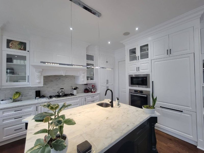 Before
 After
After
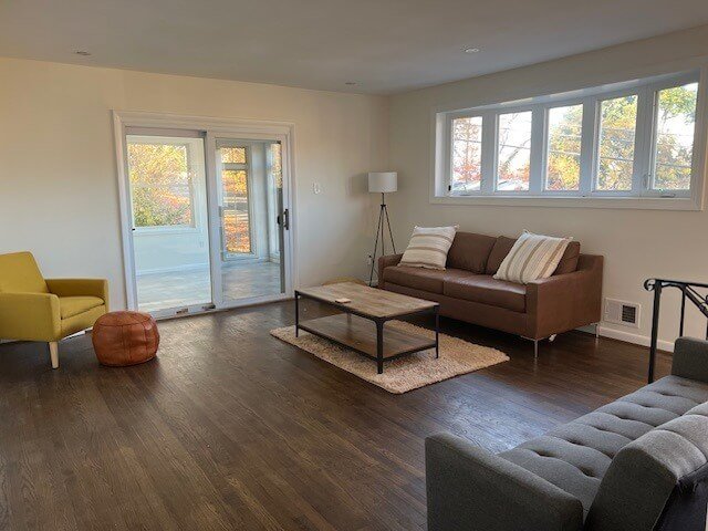
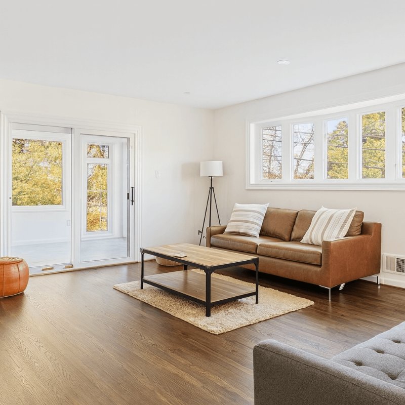
6. The living room with the dark floor problem
Large sliding glass doors and a strip of windows along the back wall mean this living room has plenty of natural light in real life. But in the photo, the camera exposed for the bright outdoor view, which left the interior significantly underexposed. The dark hardwood floors absorbed what little interior light remained, and the furniture, which is actually a warm brown leather sofa and a mustard armchair, looks muddy and undefined. After enhancement, the interior exposure was lifted to match the outdoor brightness, the floor detail came through, and the furniture colours read accurately. The room now looks as spacious as it actually is.
 Before
 After
After
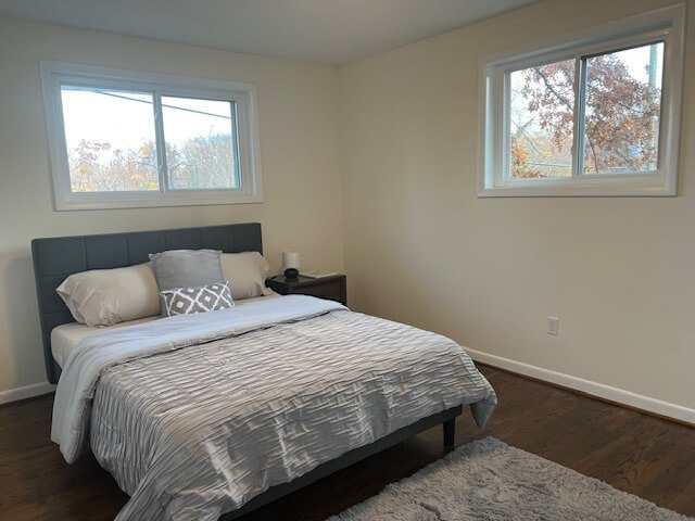
7. The sparse bedroom that needed atmosphere
Minimally furnished rooms are actually harder to photograph than cluttered ones, because there is less to distract from the quality of the light and the walls. This bedroom has a clean, modern look, but the original photo makes it feel cold and uninspiring. The walls have a slight yellowish cast, the bedding looks flat, and the two windows showing autumn trees outside add a gloomy tone to the whole shot. After enhancement, the wall tones were corrected to a clean white, the bedding textures were sharpened, and the overall atmosphere shifted from empty to calm and inviting. A small change with a noticeable effect on how the room feels.
 Before
 After
After
8. The high-rise apartment with the exposure imbalance
This is a stunning apartment, clearly in a high-rise with a panoramic city view. But photographing floor-to-ceiling windows in broad daylight is one of the hardest scenarios in real estate photography. The camera had to choose: expose for the bright exterior and lose the interior detail, or expose for the room and blow out the windows. Here it chose the latter, leaving the interior dark and the city view washed out. After processing, both were recovered: the interior came up to a proper exposure showing the dining table, the leather chairs, and the layout clearly, while the windows retained the city skyline. The property now looks as impressive in the photo as it does in person.
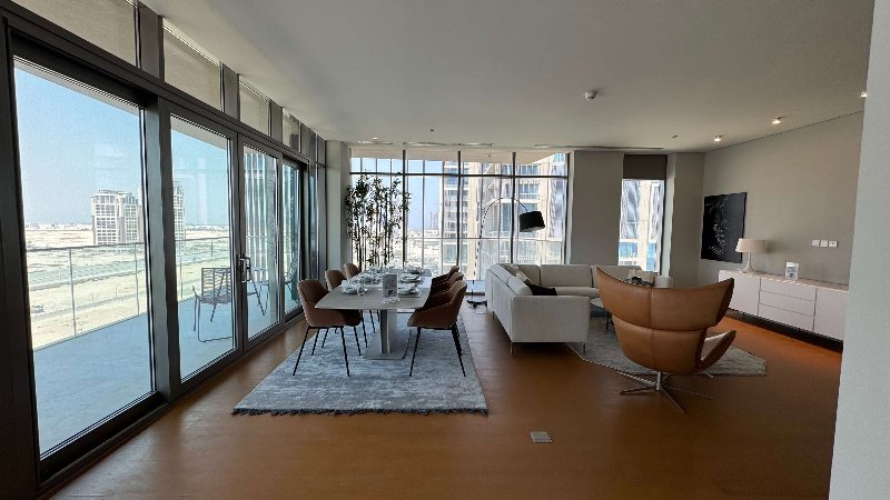 Before
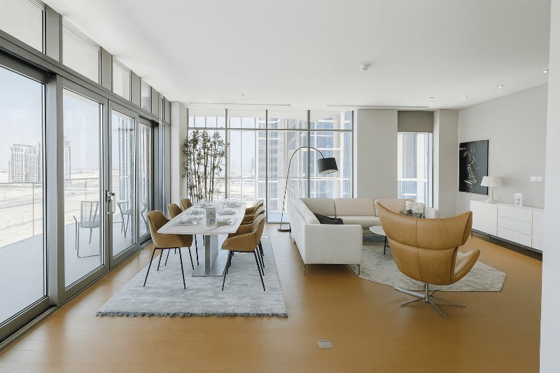 After
After
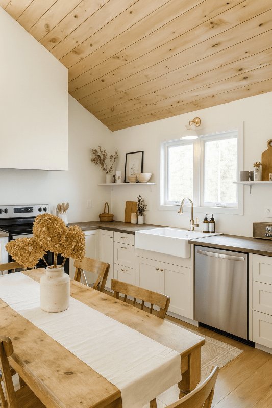
9. The cottage kitchen with the warm wood ceiling
Pine plank ceilings are beautiful in person. In photos, they tend to pull the white balance toward amber and make the whole room look like it was shot under candlelight. This cottage kitchen is charming: farmhouse sink, open shelving, a wooden dining table. But the original photo is dominated by the warm orange tone of the ceiling, which bleeds into the white cabinets, the countertops, and even the wall colour. After correction, the white balance was shifted to neutral, the cabinets read as the cream-white they actually are, and the character of the space came through without the heavy colour cast masking it.
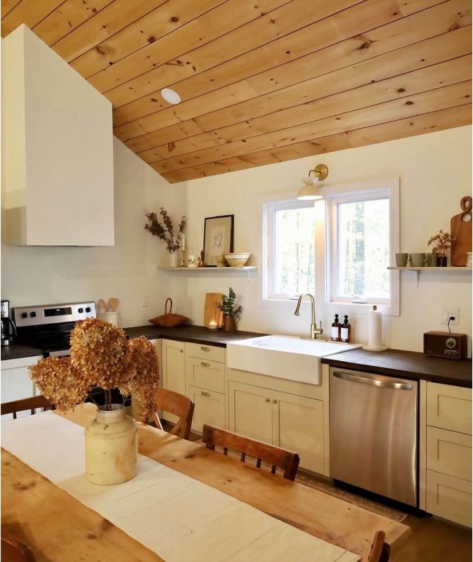 Before
 After
After
10. The open-plan house that just needed polish
Not every photo needs dramatic intervention. This large open-plan space has good composition, reasonable exposure, and a clear view of both the living area and the kitchen behind it. But the warm recessed lighting and the ceiling fan give the whole image a slightly orange-yellow tone, and the textures, the wood floor, the sofa fabric, the area rug, look a bit soft. After enhancement, the white balance was corrected to neutral daylight, the micro-contrast was increased across the textures, and the colours became more accurate. It is the difference between a photo that reads as decent and one that reads as professionally shot.
 Before
 After
After
What these 10 examples have in common
Looking across all of them, a few patterns emerge. White balance and lighting issues account for the majority of problems. Most photos are shot in mixed light, either with warm indoor bulbs competing with daylight, or on overcast days that flatten everything out. Correcting this one thing makes a larger difference than almost anything else you can do.
The second most common issue is exposure imbalance. Cameras struggle when there is a bright window or glass wall in frame. The result is either a dark interior or blown-out highlights, and neither represents the space fairly. Recovering both in post is one of the most valuable things enhancement can do for a real estate photo.
Texture and sharpness come third. Even well-exposed photos often look slightly soft when they come off a phone or a kit lens. Increasing local clarity makes floors, fabrics, and surfaces look defined and high-quality, which signals to potential guests that the property itself is well-maintained.
If you manage one property or fifty, the gap between an average photo and a good one is rarely about the camera. It is almost always about the light, the colour, and the finishing. All three are fixable after the fact, which is the whole point of tools like ProntoPic for Airbnb hosts.
The photos in your listing are the first thing a potential guest sees. In most cases, they are also the deciding factor. If you are curious what your own photos look like after enhancement, you can try the first three for free, no credit card required.
See what ProntoPic does to your listing photos
Upload any property photo and get a professional-quality result in under 60 seconds. First 3 photos are free, no credit card required.
Try ProntoPic free